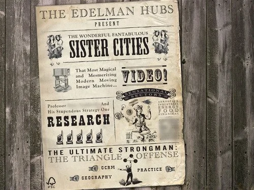
Vaudeville Poster — The original Infographic?
I had some fun a few weeks ago designing the above for an Edelman executive to present at an internal meeting. Each presenter was allowed 5 minutes and one single slide. So how do you make 5 items of content distinct and memorable with one screen? Not with bullets, you don't.
I threw out the idea of an old time show poster as a solution for fitting a lot of differing content onto a single page which made me think: could the vaudeville/music hall poster have been the original infographic?
In any case, it was apparently a hit.

